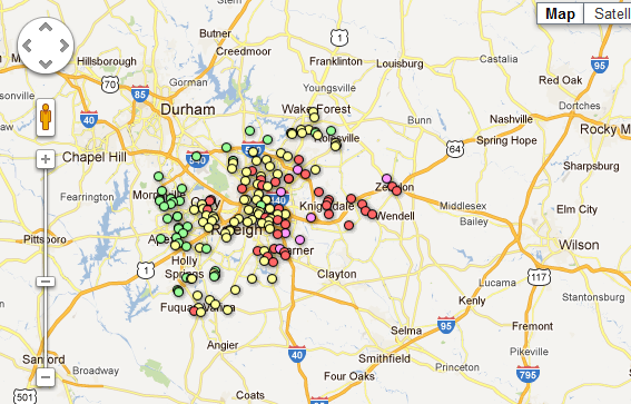
Mapping of new Wake schools data by the Record shows a clear trend of schools becoming more high-poverty moving from west to east across the county.
The map was created using data released at Tuesday’s Board of Education meeting. The data projects the percentage of students who will receive free-and-reduced lunch at each school next year.
Schools East of downtown Raleigh are almost exclusively high-poverty schools. Schools with more than 50 percent F&R students, represented by the red dots, are generally acknowledged to be more prone to problems and low test scores.
Moving west across the map, schools become progressively wealthier.
Green = Fewer than 25 percent F&R
Yellow = 25-50 percent
Red = 50-75 percent of students using F&R
Purple = 75 percent or more
The new controlled-choice assignment plan, which is set to take effect in the 2012-13 school year, clearly notes that its purpose is not to reduce or balance the current F&R demographics.
According to the plan, the percentages and distribution will likely remain the same as the current school year.
The new assignment plan was passed by the former Republican majority in November. A new Democratic majority is implementing the plan, despite some new board members having expressed serious doubts about its fidelity.
Share your comments: Should Wake School officials try to correct this disparity?
